Avoid This React Mistake: Inline Components and State

Contributor

Prasetya Ikra Priyadi
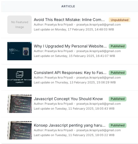
prasetya.ikrapriyadi@gmail.comIn my work, I frequently deal with features that utilize React TanStack Table. It's an excellent library for rendering tables with complex data and offering a high level of customization. One feature I often use is the ability to define a custom component for rendering data in a table cell. This can be easily achieved by passing a React component to the cell prop, which will then render your custom component inside the respective cell. This flexibility allows for a more tailored table experience, especially when dealing with dynamic or complex content.
I typically create a custom component, let's call it SummaryRender, which can receive props from the cell data. Then, I import this component into the table page and pass it as the value for the cell parameter. This approach allows the component to access the necessary data and render it accordingly within the table.
// SummaryRender.tsx

import {
  AspectRatio,
  HStack,
  Image,
  Link,
  Tag,
  Text,
  VStack,
} from "@chakra-ui/react";

export function SummaryRender({
  row: {
    original: { title, author, updated_at, status, slug, featured_image },
  },
}: CellContext<ArticleListData, unknown>) {
  return (
    <HStack>
      <AspectRatio maxHeight="250px" width="100px" ratio={4 / 3}>
        <Image
          src={featured_image}
          alt={title}
          objectFit="contain"
        />
      </AspectRatio>
      <VStack spacing="0" width="400px">
        <HStack width="full" justifyContent="flex-start">
          <Text
            as={Link}
            width="300px"
            overflowX="hidden"
            textOverflow="ellipsis"
          >
            {title}
          </Text>
          <Tag size="sm" colorScheme={statusTagConfig.colorScheme}>
            {statusTagConfig.label}
          </Tag>
        </HStack>
        <HStack width="full" justifyContent="flex-start">
          <Text
            fontSize="xs"
            color="monochrome.700"
            width="full"
            overflowX="hidden"
            textOverflow="ellipsis"
          >{`Author: ${author.name} - ${author.email}`}</Text>
        </HStack>
        <HStack width="full" justifyContent="flex-start">
          <Text
            fontSize="xs"
            color="monochrome.700"
          >{`Last update on ${updatedDate} WIB`}</Text>
        </HStack>
      </VStack>
    </HStack>
  );
}
// Page.tsx
import { CellContext, ColumnDef } from "@tanstack/react-table";
import { Table } from "@/component/Table"
import { SummaryRender } from "@/component"
import { getArticlesData } from "@/apis"
export function ArticleList() {
const columns: ColumnDef<ArticleListData>[] = useMemo(
() => [
{
id: "summary",
header: "Article",
cell: SummaryRender,
},
],
[]
);
const data = getArticlesData()
const tableProps = useReactTable<ArticleListData>({
data,
columns,
});
return <Table {...tableProps} />
}
However, there are cases where you need to create a custom component that depends on the current state, which can make things trickier. For example, if you want to display a "Delete" button only when the user has admin privileges, you can extend the component’s parameters to accept an additional isAdmin prop. Then, you can perform a check like this:
// ActionBox.tsx

import { HStack, IconButton } from "@chakra-ui/react";

type ExtendedCellContext<T> = CellContext<T, unknown> & { isAdmin: boolean }

export function ActionBox({
  row: {
    original: { title, author, updated_at, status, slug, featured_image },
  },
  isAdmin
}: ExtendedCellContext<ArticleListData, unknown>) {
  return (
    <HStack>
      <IconButton
        size="sm"
        variant="outline"
        aria-label="article-edit"
        icon={<EditIcon />}
      />
      {isAdmin && <IconButton
        size="sm"
        variant="outline"
        aria-label="article-delete"
        icon={<DeleteIcon />}
      />}
    </HStack>
  );
}
But how do you pass it to the column object? This won't work because TypeScript will detect that the isAdmin prop is missing, resulting in a type mismatch.
Creating an Inline Component
One solution is to define an inline component inside the ArticleList component that returns the ActionBox component, like this:
// Page.tsx

import { CellContext, ColumnDef } from "@tanstack/react-table";
import { useProfile } from "@/hooks"
import { Table } from "@/component/Table"
import { SummaryRender, ActionBox } from "@/component"
import { getArticlesData } from "@/apis"

export function ArticleList() {
  // use hooks to get user isAdmin role
  const { profile } = useProfile()
  // Render an inline component
  const ActionBoxRender = (props) => <ActionBox {...props} isAdmin={profile.isAdmin} />

  const columns: ColumnDef<ArticleListData>[] = useMemo(
    () => [
      {
        id: "summary",
        header: "Article",
        cell: SummaryRender,
      },
      {
        id: "action",
        header: "Action",
        cell: ActionBoxRender,
      },
    ],
    []
  );

  const data = getArticlesData()
  const tableProps = useReactTable<ArticleListData>({
    data,
    columns,
  });

  return <Table {...tableProps} />
}
This approach works as expected, but under the hood, it could lead to degraded performance because React will treat the inline ActionBoxRender function as a new component on each render. This happens because React re-renders the component whenever its dependencies change, and inline functions are considered as new references during each render. As a result, React may re-render child components unnecessarily, which can affect performance, especially in larger applications.
Every time a parent re-renders, the virtual DOM compares the new child components with the previous ones. If the child is re-created, the virtual DOM treats it as a new component and forces a re-render. This can be expensive in terms of performance for deeply nested or complex components.
Optimization with useCallback hooks
To ensure that ActionBoxRender remains stable and to prevent unnecessary re-renders, we can optimize it using useCallback like this:
// Page.tsx

import { CellContext, ColumnDef } from "@tanstack/react-table";
import { useProfile } from "@/hooks"
import { Table } from "@/component/Table"
import { SummaryRender, ActionBox } from "@/component"
import { getArticlesData } from "@/apis"

export function ArticleList() {
  // use hooks to get user isAdmin role
  const { profile } = useProfile()
  // Render an inline component with useCallback
  const ActionBoxRender = useCallback(
    (props) => <ActionBox {...props} isAdmin={profile.isAdmin} />,
    [profile.isAdmin]
  )

  const columns: ColumnDef<ArticleListData>[] = useMemo(
    () => [
      {
        id: "summary",
        header: "Article",
        cell: SummaryRender,
      },
      {
        id: "action",
        header: "Action",
        cell: ActionBoxRender,
      },
    ],
    // Since ActionBoxRender can change, we need add it as dependency
    [ActionBoxRender]
  );

  const data = getArticlesData()
  const tableProps = useReactTable<ArticleListData>({
    data,
    columns,
  });

  return <Table {...tableProps} />
}
By wrapping the ActionBox component inside useCallback, we can memoize the function, ensuring it only gets redefined when profile.isAdmin changes. This will prevent React from treating it as a new component on each render, improving performance.
Conclusion
Passing inline functions directly into component definitions can lead to unnecessary re-renders, which can degrade performance, particularly in larger applications. To avoid this, we can optimize it with useCallback to memoize functions ensures that components remain stable across renders, preventing unnecessary updates and optimizing the app’s performance. By implementing such optimizations, you can enjoy the flexibility of custom components without sacrificing performance. balancing flexibility with performance is key in React development. Understanding how React handles re-renders and using optimization techniques like useCallback can help build more efficient, scalable applications
Article For You
Built with Next.js and Chakra UI, deployed with Vercel. All text is set in the Inter typeface.
Copyright 2026 | prasetya_webspace-v3.1.0